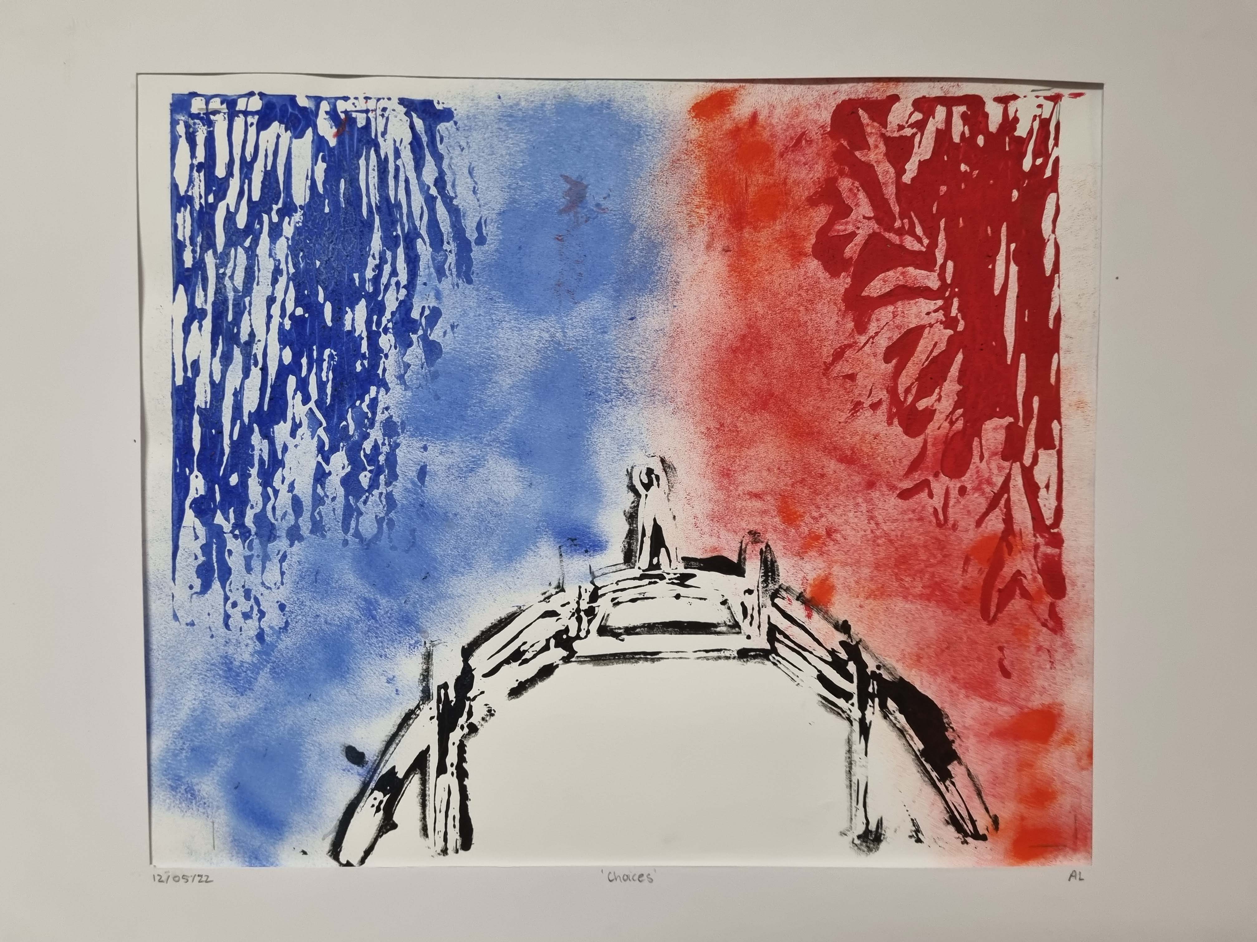
'Choices'
My final artwork, ‘Choices’ is a depiction of social and emotional upheaval through the struggles we face in making difficult decisions. The goal I wanted to achieve through this artwork was to make it more symbolic than realistic, to add a deeper meaning and a more interesting piece. I achieved this goal by using lino. The lino gave the exact textures I wanted which I believe made the artwork more symbolic.
The colours used, blue and red, are stereotypically classed as ‘good and bad’. Fortunately, they also contrast very well, which made the artwork more eye catching to an audience. However, believe I could have improved on the detail of the artwork and made it a little more attractive. What inspired me to do this artwork was the message I needed to convey about social (emotional) upheaval.
Personally, I know I struggle with making decisions whether they be big or small. Making choices is hard, and sometimes we do not know which choice is the right choice. That is the message I wanted to convey through this art piece. The person standing on the bridge symbolises someone trying to decide which path to take, and they find themselves stuck in the middle. A personal critique of my artwork is the missing patch of colour under the bridge, and how the blue and red sides are not centred.
For future improvements I would try my best to make the lino print more centred, and to not make it look so childish. I was not inspired by any artist in particular for this artwork. Ultimately, I am not too happy about the final outcome of my artwork and know I could do better next time now that I have the knowledge and understanding of Lino. However, I know the message behind it is clear.

